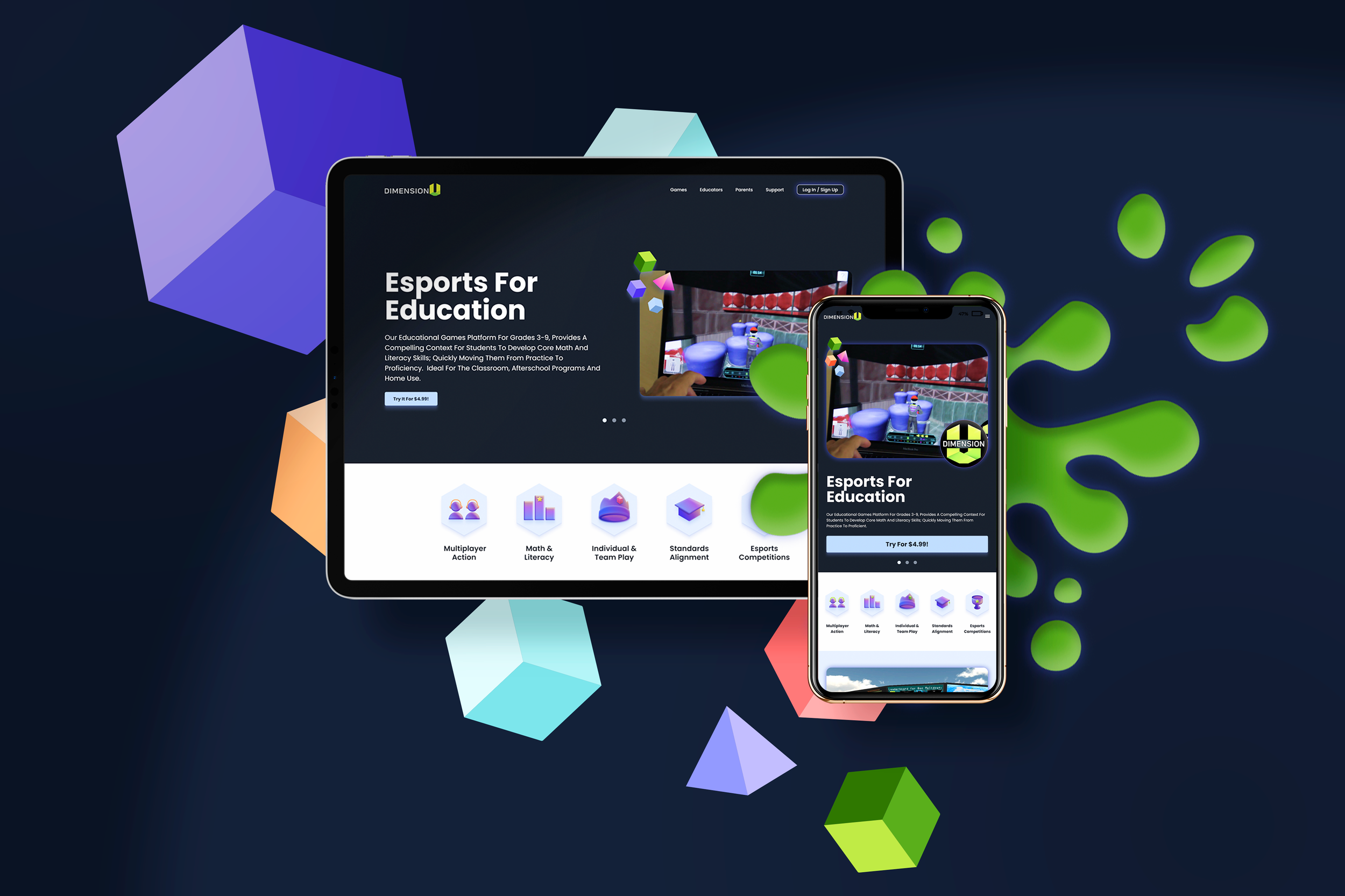
DimensionU is an educational platform for grades 3-9 that provides compelling context for students to develop core math and literacy skills, quickly moving them from practice proficiency. Ideal for the classroom, after school programs and home use.

Considerations
DimensionU’s original website was outdated and no longer met the company’s needs. Some of things that I had to take into consideration were:
DimensionU is a small company in the public education sector
The timeline was tight
The website would be built by developers (vs in a CMS)
Based on these findings, and keeping in consideration timeline and budget, I made a plan:
Start with a Heuristic Evaluation
Continue with a Competitor Landscape report
Determine who the target audience is
Audit the content
Finalize the look with moodboards
Wireframe
Design
Step 1: Heuristic Evaluation
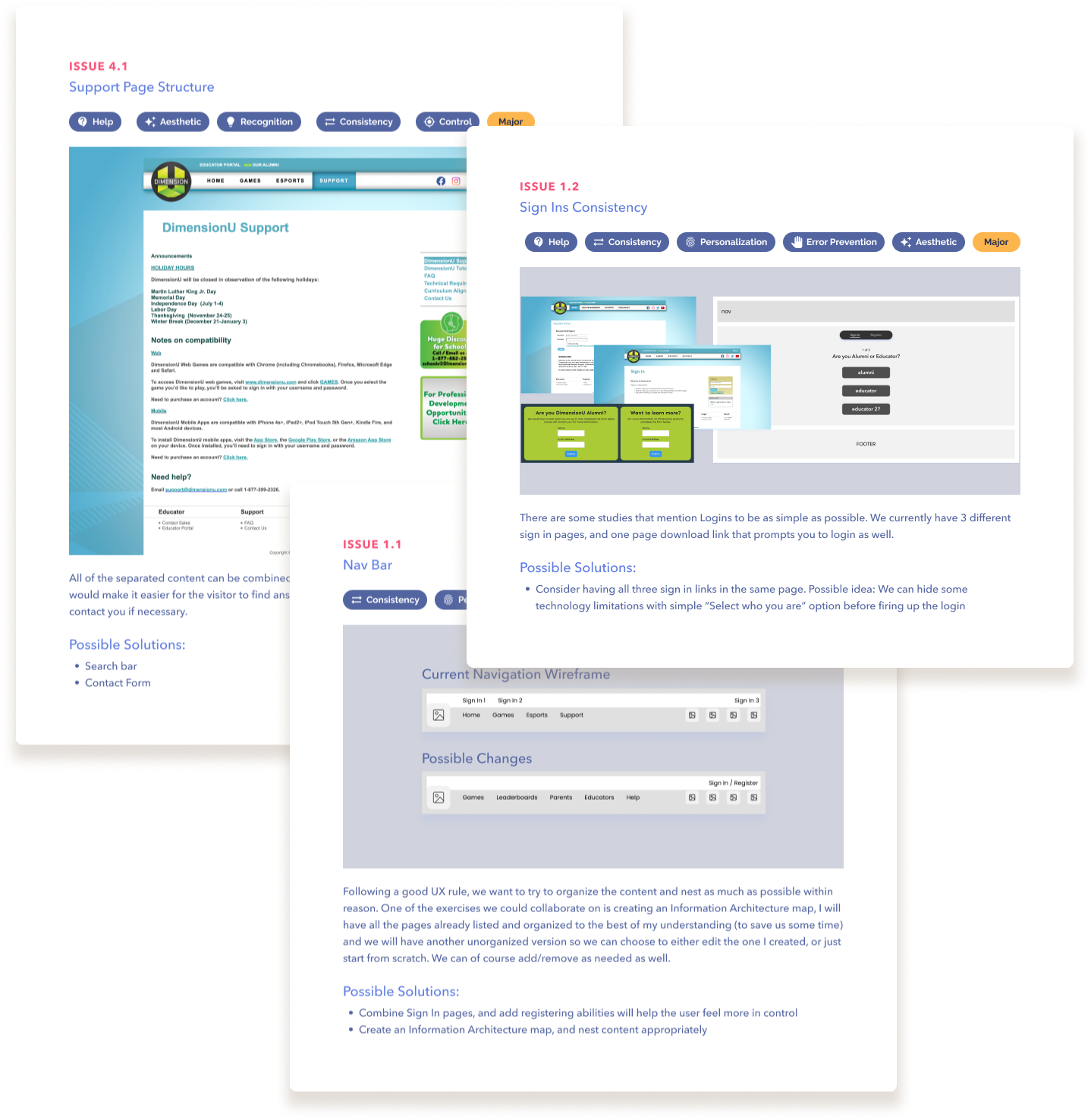
I performed a full evaluation and, although the website was outdated, and Google Analytics did not provide much data (outdated mappings) the most serious findings were:
Accessibility issues (contrast, text)
Confusing CTAs (multiple CTAs going to the same page)
No UI Pattern to follow (e.g. multiple button styles)
No product images
Very little marketing content
Step 2: Competitor Landscape (design)
I located competitor websites, this comparison helped identify what type of content the client needed to include in their website.
This exercise also allowed us to develop types of personas (three personas), and what type of content would be needed for each.
Step 3: Personas
DimensionU is an educational software that is used in and out of the classroom, this means that the users are:
Students: The end-user of the games, they would visit the website to sign in to the games, view scoreboards, and events
Educators: DimensionU’s main clients, they set students up with their login information, they would normally visit the website to Sign in, to review the programs and read about the games
Administrators: As the leaders of the school, Principals are a good example of an administrator. When visiting the website, they would want to know any tech-specific information, and pricing.
Step 4: Content Audit
I performed a content audit using the competitive landscape. Then, I compared this list with the current website, made some adjustments and came up with a good plan with the client where we would keep the language as general as possible in some areas where we had the content a bit outdated, which would then be a quick iteration later.
Step 5: Mood boards
Using all the data of our research, I created a couple of mood boards for the client. In this case, I created them to look like home screens, it really helped the team visualize what the website could look like.
Being that DimensionU is an educational gaming site, I thought it would be appropriate to go with darker tones and “glow” in different forms.
One of the options was going to lean more on the objects over dark background with color poking through.
The second one leaned on a darker color with three dimensional accents in happy colors. The client selected the latter one.
Step 6: Wireframes
Creating wireframes is something I do for clients so they have a good idea of where the content of the project will live. It helps us stay focused on organization of the content to ensure a seamless experience.
Step 7: Design
Details
Some special things I did for the DimensionU team were custom illustrations and marketing materials to now match the new look, here are some examples:


