BACKGROUND
As a Tech-Startup, WeaveUp needed someone who had both web-design and content management experience plus textile design to fit the needs of a growing company. I joined WeaveUp in the spring of 2018. WeaveUp is a company that offers various products in the Digital Printing business:
Design Library: crowd-sourced library of pattern designs used through an API by various clients who have purchased a white-label website.
Customization Tool: allows for patterns to be customized by scale, color and repeat. Making color-matching a breeze.
Print Room Solutions: a software that simplifies the printing process and workflow of print rooms.
TASK
Auditing the website’s content, including the blog to recommend improvements seemed to be the best first step. There were some questions that kept coming up from clients:
How to properly set up designs so that they could be customized by the tool.
How to get started?
Where can I find out information that pertains to textile designers?
What is WeaveUp?
A problem that I noticed right away was the fact that the website was hosted in a combination of “app” which required development work and Wordpress which I had access to. Coming in to a large technical debt was going to make it difficult to implement changes timely, so I decided to make a plan where we could implement changes/improvements while adding second-phases in the development roadmap.
ACTION
After learning how to prepare the artwork correctly in different programs like Adobe Photoshop and Illustrator, which involved Indexing the colors in the files, reduce colors to 12 or under and save them as Tiff, I was ready to implement a few things:
-

I wrote a blog post, with step-by-step instructions on how to set up files correctly. It was very interesting to see - and explain, how some designs have more colors than what can be seen with the naked eye. Creating this post, including many screen shots and directions, helps designers understand the requirements.
-

A big concern of some clients was the amount of selections, too much to choose from! I collaborated with the Design Team to create ready-to-buy curated collections in various color ways to help clients take the first step to customizing.
-

Content for designers was scattered throughout the website, making it difficult to locate information. By crafting the “create” page, we compiled all of the information a designer may want to know before uploading their designs. From design tips, to policies and tools.
RESULTS
We have seen an increase and improvements in the following:
Color-separated designs have increased.
Independent Designer sign ups have doubled.
Consumer sales have improved.
Increase in business opportunities.
-

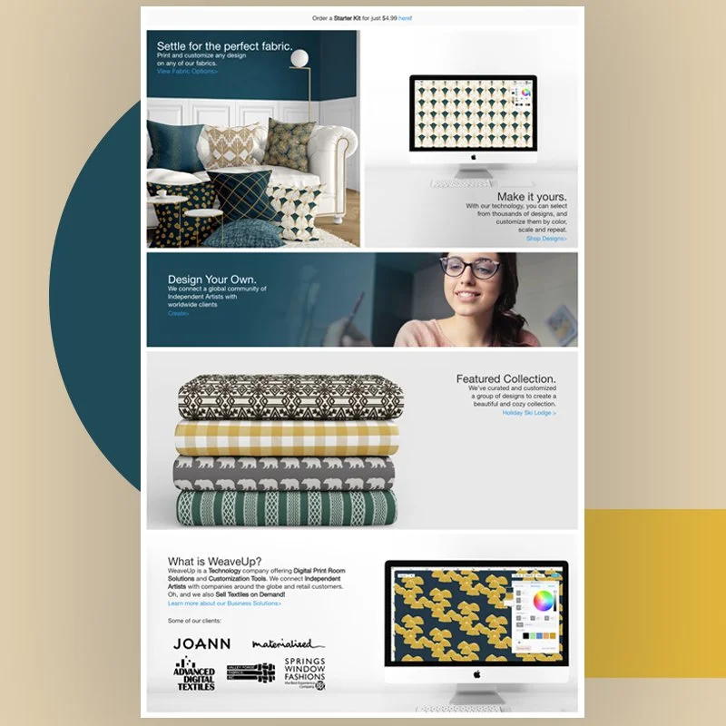
What is WeaveUp? The answer to this question is different depending on who you are. If you are a designer, WeaveUp is a platform that connects you with large companies around the globe and helps you earn royalties for your selected work. If you are a printing company, WeaveUp provides you with a software to improve your workflow. Lastly, if you are a fabric aficionado, it’s a website where you can customize designs and order fabrics to your heart’s content. To explain all of these things in a more detailed manner, I designed and built WeaveUp Business Solutions.
-

Summer '18
Bold designs represented with vibrant, summer colors. Used imagery to represent the potential of the platform.
-

Early FALL’18
Bright colors to get customers excited about season changes. Created a new floral pattern for WeaveUp as the main focus of the image.
-

LATE FALL’18
Greenery, rust, darker colors used to create the landing page for this season. I also created the leaves design featured in the hero image for WeaveUp.
-

WINTER’18
I used gold and teal tones for this home page to represent sparkle and an unexpected holiday decoration. I also divided the original hero image into two blocks to represent the most important areas of the website.
-

Spring’19
Created many collections to help the shopping experience. Customers can now shop by collection, color, color within the collection, and all designs. There’s also a designated Artist area to help artists understand what’s in for them from the first screen.
-

Blog Post
Make your designs shine … literally!
(WeaveUp Blog)
-

Blog Post
(Video)
-

Blog Post
-

Blog Post
-

-

-

Blog Post
-

Blog Post
-


