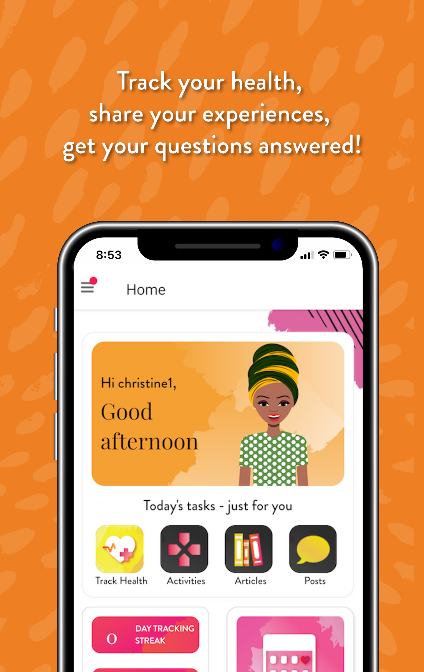
Custom Avatar Illustrations
Dates: 2022
Role: Freelance Illustrator
Client: One Cow Standing for UNC
AVATAR ILLUSTRATIONS
The University of North Carolina (UNC) has a division that studies patient behaviors while using new medications, one of their projects involved creating an app to track patients’ medication intake and some lifestyle activities.When I was asked if I wanted to participate by figuring out a way to create fun, vibrant avatars, I jumped right in!
Part of the challenge was figuring out a way for the user to personalize their avatar without me having to create hundreds of versions of each avatar,
research
This app is funky, colorful and bold and caters South African females, and the Avatars played an important role in the app usage so it was important that the options were going to be attractive and fun for the end-user. This project had some amazing collaborators in South Africa that were key to this research as they provided lots of content that helped point out where to find fashion inspiration.
2. ARTWORK PLANNING
Like I mentioned in the beginning, the images need to be Scalable Vector Graphics (SVGs) so they could be manipulated as planned. I knew I was going to have to create them in illustrator.
There are a few ways this could have worked, for example, we could have created shapes and turned them into masks, but we ended up deciding on just drawing each piece individually and then layer them together.
Too many options can be overwhelming to use, and to code. So, thinking through how to layer shadows, highlights etc became a fun nut to crack.
The image to the left (or the top, if you are on a cellphone) represents the “basic avatar” and the numbers represent the different customization options:
0. Select the skin tone
Select the hair style (and color)
Select the eyes (and eye color, plus, the eye shadow color)
Select the nose style
Select the mouth (and the lipstick color)
3. Layer Accessories
In addition to the main characteristics of the Avatars, we also wanted the users to be able to accessorize and have the same customization experience but at a smaller scale, after all, there are phases and budgets to adhere to, so, with this in mind, I created the artwork for accessories the same way (so that the layers could be customized similarly to the avatars), but instead of making those layers customizable, they were used as one.!
4. Shadows and Highlights
With so many options, it was important that there was a way to edit the color of the element, without asking the user to also color the shadows and highlights that the avatars required to show depth.
So, lightbulb emoji here, layers with 50% opacity in plain #FFF (white) and #000 (black)
5. Preparing layers for code
I know one day, far from today, I will find a script to do this, but, at the time, I looked and looked, but I could not find an easy enough script that I was confident in using,
Each piece of the avatar consisted of:
Main Color
Accent Color
Shadows/Highlights
Non-editable elements (eye lashes, white teeth, etc)
Naming them this, would allow for the code to edit it by associating the layer names to styling.


